In this post, we will be addressing the quality of machine learning algorithms for solving classification problems. We will consider the "recall-precision" curves as well as Gain, Lift, K-S (machine learning curves), and a table for analyzing profitability. Most importantly, we will define all curves in terms of already familiar concepts that are often used in ML (instead of inventing terminology for each curve).
Let’s discuss popular curves that are built to assess the quality of the classification. We will assume that the classification problem is solved with two classes: positive (1) and negative (0). The algorithm gives an assessment of belonging to class 1; when choosing a threshold, all objects whose ratings are not lower than the threshold are assigned to class 1, and all the quality metrics are immediately determined, such as recall, precision, etc. All curves will be illustrated in the model problem with linear densities that is described in this post.
Recall-precision curve. As the name suggests, this curve is plotted in terms of recall (R) and precision (P). Fig. 1 and 2 show the PR curves in the model problem where the blue curve stands for a theoretical curve, the red thin lines depict curves constructed from samples with corresponding densities. Fig. 1 stands for samples consisting of 300 objects, while fig. 2 stands for samples consisting of 3000 objects. Note that in general, the PR curve is not convex. The area below it is often used as a metric for the quality of an algorithm. In our theoretical problem, the PR-area is 5/6 = 0.8(3), for samples of 300 objects after 100 experiments (sample generations) the estimate is 0.839 ± 0.024 (std), for samples of 3000 - 0.833 ± 0.012 (std).
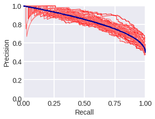
fig. 1 PR curves in the model problem: theoretical (blue) and empirical (red) for a sample of 300 objects.
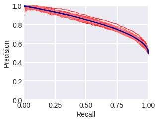
fig. 2 PR curves in the model problem: theoretical (blue) and empirical (red) for a sample of 3000 objects.
Here is the code to calculate the area under the PR curve:

fig. 3 Fig. 4 shows the way the empirical estimate of the PR curve area depends on the sample size for different proportions of classes: when the classes are equally probable and when there is an imbalance in classes. The lighter area shows the standard deviations from the mean. It can be seen that SDs are larger in a problem with class imbalance.
Estimated AUC_PR for different sample sizes and class balances.
The area under the PR curve (AUC_PR) is recommended to be used in problems with class imbalance, the reason being that this curve more accurately describes the correct classification of objects with large estimates, while the ROC-curve is the difference in the distributions of objects of different classes according to estimates. Let’s consider whether such reasoning is correct. What about an increase in the error in estimating the area under the PR curve in imbalance problems? Now let’s consider the fact that when the balance of classes changes, the value of AUC_PR changes, so, for example, in case we remove a random half of one of the classes from the sample (AUC_ROC practically does not change) (fig. 5).
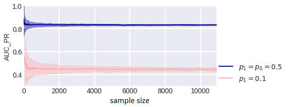
fig. 4
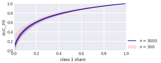
fig. 5
AUC_PR estimate for different class balance.
Gain Curve (Chart) is a curve in the coordinates "proportion assigned by the algorithm to class 1", i.e. Positive Rate:

fig. 6
m is the number of objects in the sample, and "what percentage of class 1 the algorithm classified as positive", i.e. True Positive Rate:

fig. 7
Naturally, PR and TPR depend on the binarization threshold, and the curve itself is constructed when the threshold runs through all possible values. There are a few surprises here. First of all, from the definition, we recognize the Lorentz curve from machine learning, which is more often called a Lift Curve. Note that the same graph with a slight change (for Y instead of TPR - TP) is also called a "Lift Curve" here, and here it’s called CAP (Cumulative Accuracy Profile). The second surprise is that later on in this post will name the second curve a “Lift Curve” (sometimes the third curve goes by the “Lift Curve” name, but we chose the name that is used in most sources).
Fig. 8-10 show the Gain Curves in our model problem: theoretical and empirical (thin red lines) lines that are calculated from samples of different sizes and with different class balances.
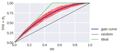
fig. 8
Gain Curve in the model problem: blue stands for theoretical, red stands for empirical for a sample of 300 objects.
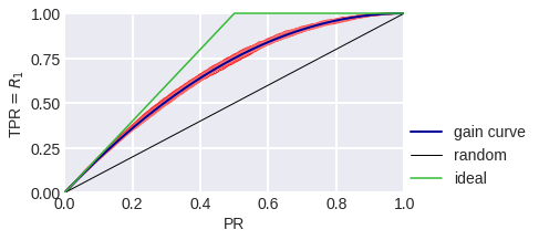
fig. 9
Gain Curve in the model problem: blue stands for theoretical, red stands for empirical for a sample of 3000 objects.
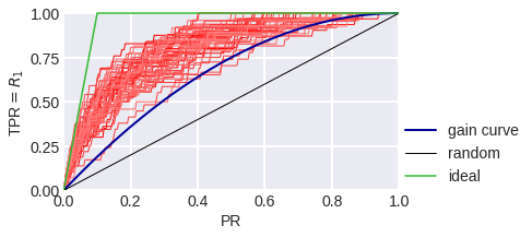
fig. 10
Gain Curve in a model problem with class imbalance: blue stands for theoretical, red stands for empirical for a sample of 300 objects.
The black diagonal line on fig. 8-10 shows the Gain Сurve for a random algorithm: it is clear that if the algorithm considers the random share of PR of all objects to be a positive class, we expect that the share of objects of class 1 that the algorithm considered positive to also be TPR = PR. The higher our curve is in relation to the diagonal, the better. The ratio of the heights of the Gain curve and the diagonal line is often depicted as a Lift Curve (Chart): it is plotted in PR and TPR/PR coordinates. Fig. 11-13 show the Lift Curves corresponding to the above Gain Curves.
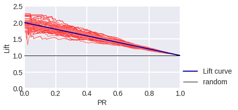
fig. 11
Lift Curve in the model problem: blue stands for theoretical, red stands for empirical for a sample of 300 objects.
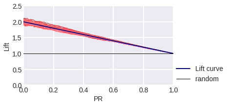
fig. 12
Lift Curve in the model problem: blue stands for theoretical, red stands for empirical for a sample of 3000 objects.

fig. 13
Lift Curve in a model problem with class imbalance: blue stands for theoretical, red stands for empirical for a sample of 300 objects.
In the banking environment, terms such as Gain-Top-10% or Lift-Top-10% are accepted and represent TPR or TPR/PR values. When 10% of objects with the highest algorithm scores we attribute to class 1 (i.e. when PR = 0.1). Also, for some reason, it is customary to build these curves only at the points PR = 0.1 (10%), 0.2 (20%),… 1.0 (100%) (we will show this further in a table).
Try calculating the area under the Gain Curve using AUC_ROC. The meaning of this area is the probability that a random object from class 1 having a higher score than a random object.
The construction of Gain and Lift Curves is logical in the "problem of offering a service": we contact customers (call or show banners, etc.), the sample consists of customer descriptions, and the target feature is the response to the offer. The Gain Curve will show how the coverage of the target audience depends on the scale of the contact.
Kolomogorov-Smirnov (K-S) chart is used to compare the distributions of objects of class 1 and 0 in the PR space (note that it’s not used for the estimates given by the algorithm). Two curves are plotted here: TPR (PR) and FPR (PR). The first curve, by the way, is our familiar Gain Curve: the proportion of objects of class 1, which the algorithm classified as class 1 (depending on the percentage of objects that the algorithm classified as class 1). The meaning of the second curve is the proportion of objects of class 0, which the algorithm assigned to class 1. Fig. 14 shows the corresponding curves for the model problem in the case of balance and class imbalance. The maximum difference between curves is often referred to as the KS distance. It is interesting that in the model problem TPR (θ), FPR (θ) do not depend on the class balance, but the K-S chart depends ... why? Try proving that for p1 = 0.1 on KSC the maximum difference TPR - FPR is achieved at point 0.3.
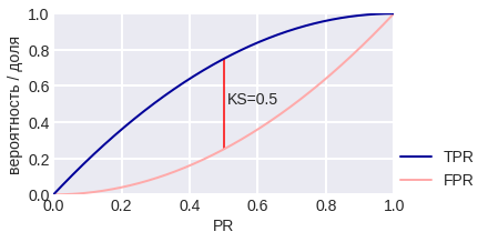
fig. 14 K-S chart for the model problem
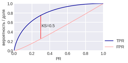
fig. 15 K-S chart for a model problem with class imbalance. Fig. 16 shows that the K-S distance can be computed with error, especially on small samples. Think about what threshold of binarization (what properties does it have) corresponds to the maximum TPR - FPR?
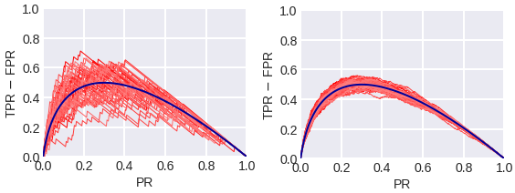
fig. 16 Empirical (red) and theoretical (blue) TPR - FPR plots in a problem with 300 objects (on the left) and 3000 objects (on the right). During Profit Analysis, the Gains table is usually used because in order to create it, the objects are sorted in descending order of the assessment of belonging to class 1, which was issued by the algorithm, and then they are divided into 10 equal parts - deciles. Each decile corresponds to a table row.
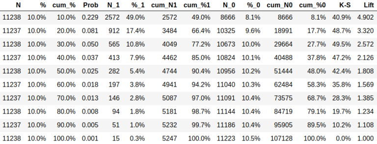
fig. 17
N - the number of objects in a decile,
% - the percentage of objects in decile,
cum_ ... - cumulative value, for example, cum_% stands for the percentage of objects up to this decile,
Prob - the percentage of objects from class 1 in decile,
N_t - number of objects from class t,
% _t - what percentage of objects of class t fell into decile,
K-S - the difference of distributions according to Kolmogorov-Smirnov: cum_% 1 - cum% _0,
Lift - ratio cum_% 1 /%.
The table can be used to calculate the economy associated with a task. For example, if the table corresponds to the task of offering a service described above, the cost of a contact is $1, and the income from the response is $5, so if you contact 10% of customers, then spending would total $11,238, income would be 2572*5 = $12,860, and profit would equal $1,622.
References
Implementations of functions for creating some of the curves can be found here.

